Friday, August 9, 2013

Homicide Statistics Bias by Gun Politics

A recent email I was forwarded, contained a list of Homicides/100,000 citizens for many countries around the world.  The email subject was "Eye Opener" and began with the title "World Murder Statistics".  What followed was a list of 109 Countries, with Honduras at the top of the list with 91.6 Homicides / 100,000.  Last on this list was the USA with 4.2 Homicides / 100,000 citizens.  The email ended with this statement:

 "ALL the countries (109) above America have 100% gun bansIt might be of interest to note that SWITZERLAND (not shown on this list)has NO MURDER OCCURRENCE!However, SWITZERLAND'S law requires that EVERYONE....

1. Own a Gun
2. Maintain Marksman qualifications....regularly
3. "Carry"........a Weapon."


As has been my habit when I see a list of numbers, I first went to the source of the data to confirm what I saw in the email.  Indeed, there is data supplied by the United Nations Office on Drugs and Crime (UNODC), which is different than the email's claimed source of the World Health Organization.  The following links will take you to these data summarized in an active table, but on these sites there are links to the complete data set from the UNODC which I downloaded and found to be the same as these links.

List of countries byIntentional Homicides / 100,000 Inhabitants

List of countries by firearm-related death rate per 100,000 inhabitants 

List of countries by gun ownership rate per 100 inhabitants

I first began to understand the "109 countries above America" and what this meant.  In order to find the Honduras rate of 91.6,  the email was referencing Intentional Homicide data.  All the data in the email were correct for all countries EXCEPT America!  The email stated that the United States rate was 4.2 / 100,000 but from the UNODC data set, the United States rate was 4.8.  In addition, there were 102 countries with rates higher than the US (not 109) and, not stated in the email, 104 countries with Homicide Rates LESS than the US.

In order to understand if all 102 (109) countries with rates worse that the US indeed had "gun bans", I utilized Gun Politics  for more information.  In summary, I could not find any country with a "100% ban" on guns.  However, many of these countries do indeed have stronger gun restrictions, but in these cases there are ways to obtain and possess a gun.  But to be clear, there are an equal number of countries with Homicide Rates LESS than the US that have more restrictive gun laws than the US.  So, it appears that restrictive gun laws do not seem to predict Homicide Rates.  But to test this I did download Gun Ownership data to correlate to Homicides which I will cover later.

Now, I wanted to investigate the comments about Switzerland! The statement that they have "no murder occurrance" is not accurate.  In fact, on this same list their Homicide Rate is 0.7 with 15 countries lower than Switzerland.  And finally, gun control in Switzerland is based on a militia concept as seen from this quote from Gun Politics.

Switzerland practices universal conscription, which requires that all able-bodied male citizens keep fully automatic firearms at home in case of a call-up. Every male between the ages of 20 and 34 is considered a candidate for conscription into the military, and following a brief period of active duty will commonly be enrolled in the militia until age or an inability to serve ends his service obligation.[76] During their enrollment in the armed forces, these men are required to keep their government-issued selective fire combat rifles and semi-automatic handguns in their homes.[77] They are not allowed to keep ammunition for these firearms in their homes, however, and ammunition is stored at government arsenals. Up until September 2007, soldiers received 50 rounds of government-issued ammunition in a sealed box for storage at home.[78] Swiss gun laws are considered to be restrictive.[79] 

So this law does not apply to everyone, but only to males.  They are required to keep a gun in the home for immediate call up to the militia (after serving in the armed forces) and does not mention anything about "carrying" a gun.  The marksmanship requirement I could not find either.  However, the most interesting fact was left out of the email.  Although required to keep the firearm at home, THEY HAVE NO AMMUNITION AT HOME!  All of it is stored in government run arsenals!  No wonder the death rate is so low!  Guns at home without ammo.

Now, moving on the actual data.  First I thought it interesting that this email used Homicide Rates by all methods.  There is a database of Homicide by Firearms by the UNODC which I found and began to look at relative to guns/firearms.  This database has fewer countries participating but there are still 70.

Applying statistics to all these lists, I was first interested in statistical differences between lower and higher rates.  I evaluated this using control charts with limits based on population sigma since the data were not time ordered, just alphabetical.  First we will look at Gun Ownership per 100 Residents.


The X chart at the top, clearly shows only one outlier country which is the US!  All other countries are within the normal range of per capita ownership.  This is probably not new news to most of you.

Next I looked at Homicide by Firearm Rates for Total, Homicide and Suicide.


There are two countries outside the upper limit signifying outside the "norm" for Total Firearm Homicides.  These two countries are El Salvador and Honduras.  If we take the 95% confidence (2 sigma), Columbia, Guatemala, and Sweden could also be considered outside the norm.  Switzerland is considered to have less restrictive gun laws, but Honduras more restrictive.


For Firearm Homicide Rates, the two outliers are Guatemala and Hungary,  At 95% confidence, add El Salvador, Honduras, Japan and Sweden.  Japan is considered to have more restrictive gun laws than the US.


Finally, the Firearm Suicide Rate shows Netherlands and Zimbabwe to be uniquely high.  Netherlands is considered to be more restrictive in their gun laws.

I could not find any correlations between gun ownership per 100 inhabitants and any of the firearm rates as seen below:


As you can see, between the two graphs, there is a small white box with a -2.8 which means the correlation is non existent and all others even weaker!  The number of guns don't correlate to any of the firearm death rates so I would conclude that other factors, including culture are more important.

My takeaway from this closer look at the email and the corresponding data is the culture of guns and gun politics has very little to do with firearm homicides and suicides.  It is time for the different groups battling over gun laws to take a new direction to make their respective cases!

Wednesday, February 20, 2013

Apple - Stock Price Drop Justified??

Following on my post of October 26, 2012, Corporate Quarterly Earnings Report's Negative Effect on Wall Street, I began to wonder if the recent $200 drop in Apple's stock price would correlate to its actual financial performance.  To note, the price began dropping in mid-September 2012, and might be now stabilizing as of this writing.

To begin my investigation, I collected, from SEC filings, Apple quarterly Revenue and Earnings figures back to March 1993.  As you have probably gathered in my other posts or from reading the information at my website (www.sustainthegain.com), I am not a fan of using Indices of these quarterly figures relative to a previous period!  Remember, a trend of one (recent quarter compared to one previous one) is not significant!  However, to reinforce this idea, I will produce a few examples of this analysis technique and make a few comments on them.  After these examples, I will return to the more meaningful analysis technique using the actual Revenue and Earnings data.

I have displayed these indices in a control chart, in order to gain some statistical reference!  I will start with Revenue, and in particular, Index versus Previous Quarter.


The first thing to notice is that at first glance, this chart appears to be stable at an average index of 1.065.  Compounded quarterly, this is a Compound Annual Growth Rate (CAGR) of 26.6%.  More importantly, the last two quarters ending Sept and Dec of 2012 are NOT uniquely different and, therefore, don't suggest any reason for a decrease in stock price.

There are some other things to take away from this chart.  The Upper and Lower Control Limits (UCL, LCL) are 1.78 and 0.35.  This means that any single quarter's index would need to be greater than 1.78 or less than 0.35 to be "out of the ordinary"!  As I have said, most companies are spending precious time explaining indices of 1.05 or .96 when a single, unique explanation is fruitless since only the common causes are acting on the results.  Whatever explanation is offered will now falsely become part of their institutional memory.   However, there is a distinct change in the pattern of these indices beginning at the middle of the chart, which is actually, March 2004, so lets take a closer look at this change.


 Although not obvious in the first graph, there has been a statistically relevant change 3/04 when the average index rose from 1.012 to 1.124.  This is the equivalent of increasing the CAGR from 4.9% to 59.6%.  Sounds great, but still nothing showing up for the 9/2012 stock drop!  My conclusion is that there was one sustainable positive change in 3/2004, and a positive "bump" in 12/1999 which could not be sustained.  My research on Apple SEC filings turned up a major accounting change in 2004 whereby the Revenue was reported differently!  It is pretty clear that the OND quarter is the highest index each and every year, since 2004!  This is one of the rare examples of indices, in control chart form, will indeed highlight a sustainable change.  The good news is that the actual quarterly results show this change as well, so still no need to use Index versus a Previous Quarter.

Below is the same Quarterly Revenue, but displayed as Index versus Year Ago (IYA).


It is more obvious that there is a change around 3/2004, but look how messy the individual indices are!  And the OND quarter pattern change is not indicated.  Also, the width of the UCL and LCL is quite large and the average 4 quarter index is 1.44 since 3/2004.  But, the last 3 quarters are all closer to the LCL than to the average, which is a signal of a possible change.  Could this explain the stock price drop??  I doubt that anyone on Wall Street is using control charts on indices!

Would Earnings as either Index Quarter Ago or Index Year Ago, show anything more??


 IQA does not show a average index shift in 3/2004 but the high OND quarter, each year, can be seen after this date.  The average index in Earnings is .962 which means that the earnings are shrinking!  This is likely an issue with the very low index at the beginning of the chart.  After 3/2004, the average index is 1.22.  Now look at IYA to see if there is anything more insights.


In the IYA case, the rise in the average index again shows near 3/2004.  But the most striking thing on this chart is the reduced variation in the earnings index after the accounting change of 3/2004.

In summary, the use of indices turned up only one sustainable change in performance since 1993, which was the accounting change in 2004.  We also did NOT see any significant changes in 9/2012 which would explain the stock price drop.  Sooooooo, we will move on to control charts using the actual quarterly results, starting again with Revenue.


Using the actual quarterly data for Revenue, you can find 4 timeframes of stable performance:  first from 3/1993 to 12/1995 when the CAGR was 18.3%;  then 1/1996 to 9/2004 when the Revenue dropped and CAGR was -0.6%;  next from 12/2004 to 6/2010 when the Revenue rose and the CAGR was 33.3%;  finally from 9/2010 to 12/2012 when Revenue jumped and the CAGR rose slightly to 35.5%.  The increasing variation (width of the blue UCL and the yellow LCL) in 9/2004 and 12/2010 is consistent with increasing quarterly values.  

In 1/1996, Windows 95 was introduced and most likely explains the drop in Revenue 1/1996!  In the following years, Jobs became CEO, Mac OS 9 ships, G4 Cube introduced, Apple Stores Open, i-Pod ships, Mac OS X ships and i-Tunes starts late 2003.  In 2004 we have the accounting change, 17" mac display and i-pod mini.  So what was the 2004 breakthrough......you pick, but my guess is accounting!  Had the pattern of Revenue (high OND quarters), I might have said this breakthrough was  i-Tunes.   The i-phone launches in 2007, 3G in 2008, but it is the i-Pad and i-Phone 4 that both launch in 2010 which creates the jump in 9/2010 and maybe only the i-Pad.  

However, trying to explain the stock price drop is more difficult!  Wall Street does not analyze using these techniques so they were not aware of the rise in CAGR!  The last two OND quarters were at or just above the UCL, but this should have been good news!  You can see that the Spring and Summer quarters had lower revenue but not outside the LCL!  It does appear that if you averaged all 4 quarters of 2012, you would get a number that falls right on the green trend line.  I decided to check this by obtaining the annual revenue numbers since 1993 which gave me the following graph.


Since 12/2004, the annual Revenue has had stable, predictable CAGR of 41% with 2012 landing right on the trend line!  So, it seems that Revenue should not have the caused of the stock to drop.  Could it have been Earnings??  Below is a graph of actual quarterly data.


There are only two sustainable breakthroughs in Earnings when there were 3 in Revenue (4 stable timeframes), but remember that one of the Revenue breakthroughs was the Accounting change that applied only to Revenue.  The Windows 95 intro in 1/96 did yeild a couple negative earnings quarters but not a shift in the Earnings.  In 12/2000 there was large loss in Earnings after 3 years of positive growth.  This lines up quite well with when Jobs became CEO.  He likely took a big write down after which the Earnings CAGR took off at 57.9%.  Then, simultaneous with Revenue, the Earnings jumped in 9/2010 but CAGR dropped to 40.1%.  Even if Wall Street had been tracking Earnings growth with control charts, the stock price should have dropped before 2012 since the 4 quarters of 2011 would have been sufficient to get a signal of this change.  But I'm sure they were not doing such an analysis!  An argument could be made that the OND 2011 and OND 2012 for Earnings were approximately the same value, when Wall Street would have expected at least a 20% year on year increase.  This was likely the stock downfall, but it is clear from the control chart that OND 2012 is just a random, non-significant result that fell between the control limits and should have been given no special consideration.  Had the stock problem been due to the i-Phone 5 intro and the "Apple Maps" problem, this should have shown up in Revenue.

An important note about Apple Quarterly Earnings News Releases:  In my 10/26/12 article referenced at the beginning of this post, I gave many examples of companies that spent significant time trying to explain every non-significant up or down in their results using Index Year Ago as the basis.  However, Apple does NOT report this way.  Every News Release follows the exact same format: the first paragraph reports actual results of this quarter and the same quarter year ago, but they do NOT use indices; the second paragraph gives sales figures but again avoids IYA; the third paragraph reports the dividends declared; the fourth and fifth paragraphs use the phrases "We are thrilled" and "We are excited" to describe the records they have set in Sales, Revenue and Earnings.  But they never attempt to tie a particular product event directly to a change from the quarter year ago!  Way to go Apple for not poisioning their institutional memory.   Might this be a contributor to their success??


Wednesday, December 12, 2012

Social Security Myths Set Straight

With all the media attention on the approaching fiscal cliff and the need to reduce entitlement spending along with increasing revenue, there has been expanding information about Social Security taxes paid and benefits collected.  Most recently I received an email on Social Security titled "Federal Benefit formerly known as Social Security".  In the widely circulated message, the writer states If you averaged $30K per year over your working life, that's close to $180,000 invested in Social Security".  In my earlier post of May 23, 2011 on the subject of Social Security and costs per person, I too discovered that an average person pays into Social Security about $198,000, so no argument about this part of the email.  

However, later in this same email the writer states: "If you calculate the future value of your monthly investment in social security ($375/month, including both your and your employer's contributions) at a meager 1% interest rate compounded monthly, after 40 years of working you'd have more than $1.3+ million dollars saved! This is your personal investment .  Upon retirement, if you took out only 3% per year, you'd receive $39,318 per year, or $3,277 per month .  That's almost three times more than today's average Social Security benefit of $1,230 per month, according to the Social Security Administration "  Note that this 3% withdrawal rate implies that the average person lives 33 years after retirement to consume the entire amount which means about 98 years old.


This email said this average person could actually have done nearly 3 times better than "investing" this money with Uncle Sam.  My "data radar" went off since this was vastly more that my previous post suggested.  So I started with the $375/month an average employer/employee paid into SS.  I can confirm that this is in the ballpark.  Next I had to look at the $375 monthly payment invested at a "meager 1% interest rate compounded monthly".  First, compounding an investment at 1% compounded monthly becomes 12.7% annual growth rate (1.01 raised to the 12th power).  I would not consider this "meager".   Also, if you used this 1% compounded monthly, your $375 monthly payment becomes $4.4 million over this 40 year work career which is very different than the $1.3 million stated in the email.

So maybe the writer meant that "meager 1%" was an annual rate but compounded monthly.  If this is the case, then the monthly compound rate would be 0.082954% (1% to the 1/12 power).  Compounding $375 per month for 40 years at this 0.082954% rate leads to a final account balance of $220,995 at retirement.  If you withdrew 3% a year from this account, that would yield $6,629 / year or $552 / month.  This is half of what this average person would get from Social Security.

So, what would the interest rate need to be so that this same $375/month would deliver $1,200/month at retirement after 40 years of employment.  Assuming the same 33 years in retirement, this would be 4% annual investment rate, but compounded monthly.  This seems about right for a conservative investment rate over 40 years.  (Please note that these calculations are all in 2012 dollars and assume that the 40 year invested amount does not continue to earn interest in the 33 years of retirement which seems to be assumption my email writer made)

So, what is my take away from this encounter??  If you get an email from anyone that has been forwarded from someone else and it has math involved, assume it is wrong until you confirm the arithmetic, including this posting!  Maybe this is also a indictment of the math education we receive in the US.


Friday, October 26, 2012

Corporate Quarterly Earnings Report's Negative Effect on Wall Street

In the last week, the Dow has suffered a 202 and a 240 point single day drop on 10/19 and 10/23 respectively.  The media coverage of these events headlined the weak Corporate Earnings as a cause of the poor performance in the Stock Market.  This rekindled my long held belief that any of these explanations do NOT have any statistical relevance to the real business results.

To check this out, I read several business sites like CNBC and Morning Star, and recorded the companies that were mentioned as explanations of these two drops in the Dow.  About 80% of the ones mentioned are also in my database of companies that I have been tracking since 1993.  So I updated results with the quarterly results announced in October for these companies to understand if any the JAS 2012 quarter were statistically relevant in comparison to previously reported quarters.

There were 15 companies in my database that were also reported in the media as contributing to drop in the Dow.  I track both Revenue and Basic Earnings per Share (EPS) for these companies which gives me 30 possible areas of concern in Corporate performance.  After analyzing all 30 areas of performance with Control Charts, only 6 of these areas showed a statistical change in the last quarter which might have negative impacts on the Dow.  However, there were also 6 which showed a positive statistical change which should have "helped" the Dow.  But key for me is that 18 of the 30 results (60%) showed NO STATISTICAL DIFFERENCE from past performance and 5 companies showed no change in either Revenue or EPS!

For example, here are a several graphs from these studies.  First, lets look at IBM which has not had a statistically important change in either Revenue or EPS over the last 11 years, including the JAS 2012 quarter!  First, the graph of Revenue:

As you can see the last red result is slightly above the average performance of 2.2% annual growth (green line), but not anything statistically different or outside the normal limits (blue and yellow).

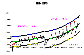
Again, the last red result for JAS 2012 is following the previous 11 year pattern.  This result is approaching the Upper Control Limit, UCL (blue) but as the absolute numbers continue the increase, so should the RSD or Relative Standard Deviation which will increase the width of the control limits.

So what shakes up Wall Street with these results??  You will read comments that express disappointment with these JAS results that "miss" the previous forecast estimate of performance either from "analysts" or the company's previous quarter report.  IF YOUR PAST 11 YEAR PERFORMANCE HAS BEEN THIS STEADY, HOW COULD YOU MISS A FORECAST?  The answer is simple: for the past 11 years, these analysts and executives have made their success by explaining every up and down in these results with "precise" singular causes.  These may range from new marketing programs, new products, acquisitions, economic conditions, material sourcing, organization changes and the like.  The problem is that when there are only normal (common) causes effecting results, the above chart is statistically stable, and has been for the last 11 years.  The "common causes" are a complex set of activities that influence results, and randomly interact in a way to create growth and variation that stay within these statistically calculated limits.  For example, below are some quotes out of the IBM most recent quarterly report that reflect this erroneous explanation:

Third-quarter net income was $3.8 billion, flat year-to-year; or $3.9 billion, up 3 percent excluding the impact of UK pension-related charges. Operating (non-GAAP) net income was $4.2 billion compared with $4.0 billion in the third quarter of 2011, an increase of 5 percent.

Total revenues for the third quarter of 2012 of $24.7 billion were down 5 percent (down 2 percent, adjusting for currency) from the third quarter of 2011. Currency negatively impacted revenue growth by nearly $1 billion.

“In the third quarter, we continued to drive margin, profit and earnings growth through our focus on higher-value businesses, strategic growth initiatives and productivity,” said Ginni Rometty, IBM chairman, president and chief executive officer.

You will first notice the use of Index versus Year Ago which shows up as a percent increase or decrease versus the same quarter in 2011.  Interesting but useless.  These changes are just chance (common cause related) and therefore cannot be explained by a single event or project.  Said another way the "currency adjustment", "initiatives" and "productivity explanations" could rightfully be used in any quarter!  However, since they have been explaining every up or down for years, their institutional memory would suggest to them that if they are working on a similar style project in the future, that they should be expecting another 5% increase in the future.  Problem is, when the future comes, the common cause system is just as likely to cause a 3% decline which in turn produces the forecast "miss" that creates the dip in the Dow.  WOW, what a huge, non-productive routine that does nothing more create more buying/selling, increasing the variation in the stock market which in turn creates winners and losers even though nothing has really changed!!  The quarterly report should have read: "Nothing has changed and IBM continues to reliably deliver a 2.2% compound growth in Revenue which in turn is generating an 18.1% growth in EPS."  These reports should go into detailed explanations only when there is a statistically relevant change and in my database of 85 companies, these changes only occur once every 7 years on average!

Here is another example of the "blamed" companies, Amazon.  First Revenue.

As you can see, consistent 30% growth for around 9 years with only variation increasing as the Relative Standard Deviation of the actuals increases over time.  No statistically relevant changes.  Now look at EPS.

Here you an see that EPS has shown a statistical change from the historical 29.1% growth.  However, it is clear that this change did not just occur in JAS 2012, but rather OND of 2011.  Why didn't the sky start falling a year ago??  Technically, nothing in the last 3 quarters has changed since a Special Cause in OND 2011.  Rest assured that Amazon has declared what terrible things have happened to them effecting each one of the last 4 quarters rather than just the one thing that happened in OND 2011.

Finally, an example of a company whose results really should have effected the markets with statistically relevant changes in the JAS 2012 quarter, UPS.

As you can see, the JAS 2012 quarter has two results in a row closer to the LCL (yellow) than to the Average (green) which is an indication that something has statistically changed outside the common causes.  This needs an explanation.

The JAS 2012 quarter is uniquely low compared to the last 2 years performance and is of concern.  This does have a unique cause which is explained in the quarterly report as seen below:

On a reported basis, third quarter 2012 earnings per share were $0.48. In August, the company announced a decision to restructure pension liabilities for certain employees. As a result, UPS recorded an after-tax, non-cash charge of $559 million during the quarter.

How could the entire quarterly reporting process be improved for all companies in such a way as to reduce unnecessary gyrations in stock market reporting and forecasting?  Simply report only when there is a special cause in the results, which will be about once every 7 years!  Using the statistically relevant explanation, a company (or analyst) would then update their forecast and continue to use this same forecast every quarter until the next, rare special cause comes along.  But alas, this would put a significant number of analysts and executives out of work and also reduce the number of winners/losers in the stock market game, which the "winners" will surely resist!


Monday, August 13, 2012

US Finances Compared to a Middle Class Family

Now that Romney has chosen Ryan as his running mate, I expect we will begin to see a great deal more news coverage of Mr. Ryan's budget proposal and his emphasis on deficit reduction.  With this news barrage coming, I thought it could be instructive to compare how a middle class family might manage their finances and compare this to how the United States is currently managing its (our) money.

This middle class family is struggling in the current economy and it is complicated by the fact that the  aging mother has had to move to a nursing home.  This family is working to cover the nursing home expenses beyond what her social security check is worth and she does not qualify for Medicaid.  The family has after tax income of $23,020 in 2011, and expenses, including mother, of $36,030.  The family had moved into Mom's old house which is in a good neighborhood but required significant renovations before this family could move in.  So, with the renovations and Mom's 2011 nursing home support rolled into the house financing, they have a mortgage of $101,280 with a pre-renovation value of $151,080.  This yields a monthly payment to the bank of $512 which is 27% of their monthly after tax income.  Looks like a pretty manageable situation, but how long can they continue to roll each years's overspending into their mortgage??

In the table below, you can see the financial picture for 2011 and then the family's best forecast for 2021.


You will see that income is rising a bit faster than expenses since the kids will be going to school and the other parent will begin working part time, close to home.  This family has successfully been able to roll their nursing home expenses into the mortgage and the payments are now a lower percent of their income than it was in 2011.  However, you can see that the mortgage value is approaching 80% of the value of the home, and likely the ability to roll the nursing home expenses into their mortgage will become more difficult.  They need a modified plan sometime soon after 2021.......but that is 10 years away!!  Maybe Mom's situation will change by then and their budget could be balanced!  So lets stay with the plan and update it in about 4 or 5 years.

Now lets take a look and the Federal Budget and resulting debt situation.  In the table below you will see a bit more detail with the year by year situation from the 2013 Federal Budget proposal forecast to 2021.  I think you will quickly see that by taking our family's numbers above and adding 8 zeros, you will have the US numbers in the table.


Included in the Total Expenditures is the interest payment on the debt which is only 10% of what our mock family was paying on their mortgage.  I think the number to keep in mind, which is also the numbers our lenders might be looking at, is Public Debt as % GDP.  In US history, Pubic Debt as % GDP was as high as 105% in 1946, dropped to 56.5% in 1956 and remained below 60% until 2008.  For perspective, here are some other countries 2011 Public Debt as % GDP that have been in the news: Japan, 208%; Greece, 165%; Italy, 120%; Ireland, 107%; Portugal, 103%.  So we are not yet in the danger zone, but if we want to get this ratio back to our 100 year average of 46%, we either need to increase our revenue (put everyone in the household to work) or reduce expenditures (let Mom go!).  No easy choices, but to be clear, our current US revenue levels are only large enough to cover Entitlement Programs which means all the borrowed money is being used to run the Government and the Homeland Security.  Just like any family, setting priorities will be critical, but, unlike our family, these priorities will be dictated by whom the politicians view as the largest voting block.


Saturday, August 11, 2012

Hottest July on Record - Really!

There has been a great deal of "noise" made concerning the average July temperature for 2012 which broke the old record set in 1936.  My first thought about these kinds of statements is that if you have a list of 100 numbers, one of them has to be largest among the 100.  The fact that the highest number in the list occurred in the most recent timeframe, does NOT indicate any statistical significance!  Therefore, I wanted to study these data to understand if there is any statistical significance to July 2012 temperatures.

I went to the NOAA.gov site to retrive the July Average Temperatures by year since 1895.  Indeed, July 2012 was in fact 77.56 Degrees F and outside the Upper Control Limit.  The previous record was in 1936 at 77.43 degrees F which was just inside the UCL.  Here is a X, MR Chart for the entire data set.


Notice the yellow highlighted vertical line which indicates the beginning of a 14 year period where 13 of the 14 years are all above the overall average of 74.402.  This indicates a short term shift in the average.  Beginning 1944, the results return to vary around the overall average and remain consistent at this level until 1998 when another run of 12 out of 15 years again occurs.  Within this statistically different period again the new record year occurs.

This then begs the question: "are these two 14 year periods statistically different from each other which might indicate a warming rise over these 82 years.


In the chart above, each of the two "higher" periods each has its own average and limits.  The first thing to notice is that the 1936 and 2012 temperatures are not outside the Upper Limit and, therefore, not unique.  The more important conclusion is to notice that these two averages are NOT STATISTICALLY DIFFERENT.  This is indicated in the lower left corner of the chart which also states that the year to year variation is not different between the two periods.  In spite of the fact the most recent 15 year period temperature is 0.3 degrees higher than the earlier 14 year period, these two averages are NOT statistically different.  However, rest assured that the media and even some scientists would suggest that this 0.3 degree increase is an indication of "global warming".  The "records" in 1936 or 2012 are NOT UNIQUE.  What needs to be explained is the years 1930 and 1998 when these 14 years periods of higher temperatures began.  Trying to explain what happened in each of the these two 14 year periods would be useful but difficult to connect to a phenomenea of "gradual warming".

Monday, February 27, 2012

Update: Best and Worst Presidents Relative to Debt Growth

I have been away from my blog for several months as I have just moved west!  But now that I am settled and Obama published the 2013 Budget, I thought I might update my analysis knowing that the 2011 Actuals would be published and available.  As you might expect, the 2011 Actuals do reflect the recession but surprisingly, the government receipts came in 7%  HIGHER than forecasted and government outlays came in about 7% LOWER than forecasted for 2011.

Given these 2011 results, I decided to revisit my August 17, 2011 post "Best and Worst Presidents Relative to Debt Growth" http://datainthenews.blogspot.com/2011/08/best-and-worst-presidents-relative-to.html.  Now that Obama has 3 years of actuals under his term, I decided to include him with the other presidential terms I had evaluated in the August 17th blog.  Using all the same criteria, the results and conclusions did not change, much to my surprise.  The summary table of these comparisons follows:


As before, I  evaluated each President on the GDP Growth as well as the components of Debt: Receipts (including Individual and Corporate Taxes), Outlays, Deficit, and Supplemental. As for "good" or "bad" evaluations, I am assuming higher Receipts is good and lower Outlays are good which lowers the deficit and the debt. I recognize that certain political philosophies may not support these being "good".  I also evaluated  Receipts, Outlays and Debt growth relative to GDP growth.  In all these categories, I then awarded a point each time a Presidential Term appeared in the highest two or lowest two growth rates in all these different categories.

The two Presidential terms with the highest point counts for "Best" were Clinton with 7 and Carter with 6 (Obama had 5).  The Terms with the highest point counts for "Worst" are Bush 1 with 6 and Nixon with 5 (Obama had 3).

In spite of the deficits and debt being at record levels during this recession, the Debt Growth leader is still Reagan at 15.1%.