With all the media attention on the approaching fiscal cliff and the need to reduce entitlement spending along with increasing revenue, there has been expanding information about Social Security taxes paid and benefits collected. Most recently I received an email on Social Security titled "Federal Benefit formerly known as Social Security". In the widely circulated message, the writer states " If you averaged $30K per year over your working life, that's close to $180,000 invested in Social Security". In my earlier post of May 23, 2011 on the subject of Social Security and costs per person, I too discovered that an average person pays into Social Security about $198,000, so no argument about this part of the email.
However, later in this same email the writer states: "If you calculate the future value of your monthly investment in social security ($375/month, including both your and your employer's contributions) at a meager 1% interest rate compounded monthly, after 40 years of working you'd have more than $1.3+ million dollars saved! This is your personal investment . Upon retirement, if you took out only 3% per year, you'd receive $39,318 per year, or $3,277 per month . That's almost three times more than today's average Social Security benefit of $1,230 per month, according to the Social Security Administration " Note that this 3% withdrawal rate implies that the average person lives 33 years after retirement to consume the entire amount which means about 98 years old.
This email said this average person could actually have done nearly 3 times better than "investing" this money with Uncle Sam. My "data radar" went off since this was vastly more that my previous post suggested. So I started with the $375/month an average employer/employee paid into SS. I can confirm that this is in the ballpark. Next I had to look at the $375 monthly payment invested at a "meager 1% interest rate compounded monthly". First, compounding an investment at 1% compounded monthly becomes 12.7% annual growth rate (1.01 raised to the 12th power). I would not consider this "meager". Also, if you used this 1% compounded monthly, your $375 monthly payment becomes $4.4 million over this 40 year work career which is very different than the $1.3 million stated in the email.
So maybe the writer meant that "meager 1%" was an annual rate but compounded monthly. If this is the case, then the monthly compound rate would be 0.082954% (1% to the 1/12 power). Compounding $375 per month for 40 years at this 0.082954% rate leads to a final account balance of $220,995 at retirement. If you withdrew 3% a year from this account, that would yield $6,629 / year or $552 / month. This is half of what this average person would get from Social Security.
So, what would the interest rate need to be so that this same $375/month would deliver $1,200/month at retirement after 40 years of employment. Assuming the same 33 years in retirement, this would be 4% annual investment rate, but compounded monthly. This seems about right for a conservative investment rate over 40 years. (Please note that these calculations are all in 2012 dollars and assume that the 40 year invested amount does not continue to earn interest in the 33 years of retirement which seems to be assumption my email writer made)
So, what is my take away from this encounter?? If you get an email from anyone that has been forwarded from someone else and it has math involved, assume it is wrong until you confirm the arithmetic, including this posting! Maybe this is also a indictment of the math education we receive in the US.
Wednesday, December 12, 2012
Friday, October 26, 2012
Corporate Quarterly Earnings Report's Negative Effect on Wall Street
In the last week, the Dow has suffered a 202 and a 240 point single day drop on 10/19 and 10/23 respectively. The media coverage of these events headlined the weak Corporate Earnings as a cause of the poor performance in the Stock Market. This rekindled my long held belief that any of these explanations do NOT have any statistical relevance to the real business results.
To check this out, I read several business sites like CNBC and Morning Star, and recorded the companies that were mentioned as explanations of these two drops in the Dow. About 80% of the ones mentioned are also in my database of companies that I have been tracking since 1993. So I updated results with the quarterly results announced in October for these companies to understand if any the JAS 2012 quarter were statistically relevant in comparison to previously reported quarters.
There were 15 companies in my database that were also reported in the media as contributing to drop in the Dow. I track both Revenue and Basic Earnings per Share (EPS) for these companies which gives me 30 possible areas of concern in Corporate performance. After analyzing all 30 areas of performance with Control Charts, only 6 of these areas showed a statistical change in the last quarter which might have negative impacts on the Dow. However, there were also 6 which showed a positive statistical change which should have "helped" the Dow. But key for me is that 18 of the 30 results (60%) showed NO STATISTICAL DIFFERENCE from past performance and 5 companies showed no change in either Revenue or EPS!
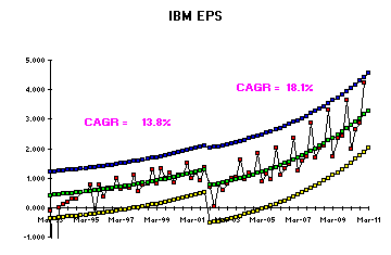
For example, here are a several graphs from these studies. First, lets look at IBM which has not had a statistically important change in either Revenue or EPS over the last 11 years, including the JAS 2012 quarter! First, the graph of Revenue:


On a reported basis, third quarter 2012 earnings per share were $0.48. In
August, the company announced a decision to restructure pension liabilities for
certain employees. As a result, UPS recorded an after-tax, non-cash charge of
$559 million during the quarter.
How could the entire quarterly reporting process be improved for all companies in such a way as to reduce unnecessary gyrations in stock market reporting and forecasting? Simply report only when there is a special cause in the results, which will be about once every 7 years! Using the statistically relevant explanation, a company (or analyst) would then update their forecast and continue to use this same forecast every quarter until the next, rare special cause comes along. But alas, this would put a significant number of analysts and executives out of work and also reduce the number of winners/losers in the stock market game, which the "winners" will surely resist!
To check this out, I read several business sites like CNBC and Morning Star, and recorded the companies that were mentioned as explanations of these two drops in the Dow. About 80% of the ones mentioned are also in my database of companies that I have been tracking since 1993. So I updated results with the quarterly results announced in October for these companies to understand if any the JAS 2012 quarter were statistically relevant in comparison to previously reported quarters.
There were 15 companies in my database that were also reported in the media as contributing to drop in the Dow. I track both Revenue and Basic Earnings per Share (EPS) for these companies which gives me 30 possible areas of concern in Corporate performance. After analyzing all 30 areas of performance with Control Charts, only 6 of these areas showed a statistical change in the last quarter which might have negative impacts on the Dow. However, there were also 6 which showed a positive statistical change which should have "helped" the Dow. But key for me is that 18 of the 30 results (60%) showed NO STATISTICAL DIFFERENCE from past performance and 5 companies showed no change in either Revenue or EPS!
For example, here are a several graphs from these studies. First, lets look at IBM which has not had a statistically important change in either Revenue or EPS over the last 11 years, including the JAS 2012 quarter! First, the graph of Revenue:

As you can see the last red result is slightly above the average performance of 2.2% annual growth (green line), but not anything statistically different or outside the normal limits (blue and yellow).

Again, the last red result for JAS 2012 is following the previous 11 year pattern. This result is approaching the Upper Control Limit, UCL (blue) but as the absolute numbers continue the increase, so should the RSD or Relative Standard Deviation which will increase the width of the control limits.
So what shakes up Wall Street with these results?? You will read comments that express disappointment with these JAS results that "miss" the previous forecast estimate of performance either from "analysts" or the company's previous quarter report. IF YOUR PAST 11 YEAR PERFORMANCE HAS BEEN THIS STEADY, HOW COULD YOU MISS A FORECAST? The answer is simple: for the past 11 years, these analysts and executives have made their success by explaining every up and down in these results with "precise" singular causes. These may range from new marketing programs, new products, acquisitions, economic conditions, material sourcing, organization changes and the like. The problem is that when there are only normal (common) causes effecting results, the above chart is statistically stable, and has been for the last 11 years. The "common causes" are a complex set of activities that influence results, and randomly interact in a way to create growth and variation that stay within these statistically calculated limits. For example, below are some quotes out of the IBM most recent quarterly report that reflect this erroneous explanation:
Third-quarter net income was $3.8 billion, flat year-to-year; or $3.9 billion, up 3 percent excluding the impact of UK pension-related charges. Operating (non-GAAP) net income was $4.2 billion compared with $4.0 billion in the third quarter of 2011, an increase of 5 percent.
Total revenues for the third quarter of 2012 of $24.7 billion were down 5 percent (down 2 percent, adjusting for currency) from the third quarter of 2011. Currency negatively impacted revenue growth by nearly $1 billion.
“In the third quarter, we continued to drive margin, profit and earnings growth through our focus on higher-value businesses, strategic growth initiatives and productivity,” said Ginni Rometty, IBM chairman, president and chief executive officer.
You will first notice the use of Index versus Year Ago which shows up as a percent increase or decrease versus the same quarter in 2011. Interesting but useless. These changes are just chance (common cause related) and therefore cannot be explained by a single event or project. Said another way the "currency adjustment", "initiatives" and "productivity explanations" could rightfully be used in any quarter! However, since they have been explaining every up or down for years, their institutional memory would suggest to them that if they are working on a similar style project in the future, that they should be expecting another 5% increase in the future. Problem is, when the future comes, the common cause system is just as likely to cause a 3% decline which in turn produces the forecast "miss" that creates the dip in the Dow. WOW, what a huge, non-productive routine that does nothing more create more buying/selling, increasing the variation in the stock market which in turn creates winners and losers even though nothing has really changed!! The quarterly report should have read: "Nothing has changed and IBM continues to reliably deliver a 2.2% compound growth in Revenue which in turn is generating an 18.1% growth in EPS." These reports should go into detailed explanations only when there is a statistically relevant change and in my database of 85 companies, these changes only occur once every 7 years on average!
Here is another example of the "blamed" companies, Amazon. First Revenue.

As you can see, consistent 30% growth for around 9 years with only variation increasing as the Relative Standard Deviation of the actuals increases over time. No statistically relevant changes. Now look at EPS.

Here you an see that EPS has shown a statistical change from the historical 29.1% growth. However, it is clear that this change did not just occur in JAS 2012, but rather OND of 2011. Why didn't the sky start falling a year ago?? Technically, nothing in the last 3 quarters has changed since a Special Cause in OND 2011. Rest assured that Amazon has declared what terrible things have happened to them effecting each one of the last 4 quarters rather than just the one thing that happened in OND 2011.
Finally, an example of a company whose results really should have effected the markets with statistically relevant changes in the JAS 2012 quarter, UPS.

As you can see, the JAS 2012 quarter has two results in a row closer to the LCL (yellow) than to the Average (green) which is an indication that something has statistically changed outside the common causes. This needs an explanation.

The JAS 2012 quarter is uniquely low compared to the last 2 years performance and is of concern. This does have a unique cause which is explained in the quarterly report as seen below:
How could the entire quarterly reporting process be improved for all companies in such a way as to reduce unnecessary gyrations in stock market reporting and forecasting? Simply report only when there is a special cause in the results, which will be about once every 7 years! Using the statistically relevant explanation, a company (or analyst) would then update their forecast and continue to use this same forecast every quarter until the next, rare special cause comes along. But alas, this would put a significant number of analysts and executives out of work and also reduce the number of winners/losers in the stock market game, which the "winners" will surely resist!
Monday, August 13, 2012
US Finances Compared to a Middle Class Family
Now that Romney has chosen Ryan as his running mate, I expect we will begin to see a great deal more news coverage of Mr. Ryan's budget proposal and his emphasis on deficit reduction. With this news barrage coming, I thought it could be instructive to compare how a middle class family might manage their finances and compare this to how the United States is currently managing its (our) money.
This middle class family is struggling in the current economy and it is complicated by the fact that the aging mother has had to move to a nursing home. This family is working to cover the nursing home expenses beyond what her social security check is worth and she does not qualify for Medicaid. The family has after tax income of $23,020 in 2011, and expenses, including mother, of $36,030. The family had moved into Mom's old house which is in a good neighborhood but required significant renovations before this family could move in. So, with the renovations and Mom's 2011 nursing home support rolled into the house financing, they have a mortgage of $101,280 with a pre-renovation value of $151,080. This yields a monthly payment to the bank of $512 which is 27% of their monthly after tax income. Looks like a pretty manageable situation, but how long can they continue to roll each years's overspending into their mortgage??
In the table below, you can see the financial picture for 2011 and then the family's best forecast for 2021.

You will see that income is rising a bit faster than expenses since the kids will be going to school and the other parent will begin working part time, close to home. This family has successfully been able to roll their nursing home expenses into the mortgage and the payments are now a lower percent of their income than it was in 2011. However, you can see that the mortgage value is approaching 80% of the value of the home, and likely the ability to roll the nursing home expenses into their mortgage will become more difficult. They need a modified plan sometime soon after 2021.......but that is 10 years away!! Maybe Mom's situation will change by then and their budget could be balanced! So lets stay with the plan and update it in about 4 or 5 years.
Now lets take a look and the Federal Budget and resulting debt situation. In the table below you will see a bit more detail with the year by year situation from the 2013 Federal Budget proposal forecast to 2021. I think you will quickly see that by taking our family's numbers above and adding 8 zeros, you will have the US numbers in the table.

Included in the Total Expenditures is the interest payment on the debt which is only 10% of what our mock family was paying on their mortgage. I think the number to keep in mind, which is also the numbers our lenders might be looking at, is Public Debt as % GDP. In US history, Pubic Debt as % GDP was as high as 105% in 1946, dropped to 56.5% in 1956 and remained below 60% until 2008. For perspective, here are some other countries 2011 Public Debt as % GDP that have been in the news: Japan, 208%; Greece, 165%; Italy, 120%; Ireland, 107%; Portugal, 103%. So we are not yet in the danger zone, but if we want to get this ratio back to our 100 year average of 46%, we either need to increase our revenue (put everyone in the household to work) or reduce expenditures (let Mom go!). No easy choices, but to be clear, our current US revenue levels are only large enough to cover Entitlement Programs which means all the borrowed money is being used to run the Government and the Homeland Security. Just like any family, setting priorities will be critical, but, unlike our family, these priorities will be dictated by whom the politicians view as the largest voting block.
Saturday, August 11, 2012
Hottest July on Record - Really!
There has been a great deal of "noise" made concerning the average July temperature for 2012 which broke the old record set in 1936. My first thought about these kinds of statements is that if you have a list of 100 numbers, one of them has to be largest among the 100. The fact that the highest number in the list occurred in the most recent timeframe, does NOT indicate any statistical significance! Therefore, I wanted to study these data to understand if there is any statistical significance to July 2012 temperatures.
I went to the NOAA.gov site to retrive the July Average Temperatures by year since 1895. Indeed, July 2012 was in fact 77.56 Degrees F and outside the Upper Control Limit. The previous record was in 1936 at 77.43 degrees F which was just inside the UCL. Here is a X, MR Chart for the entire data set.


I went to the NOAA.gov site to retrive the July Average Temperatures by year since 1895. Indeed, July 2012 was in fact 77.56 Degrees F and outside the Upper Control Limit. The previous record was in 1936 at 77.43 degrees F which was just inside the UCL. Here is a X, MR Chart for the entire data set.

Notice the yellow highlighted vertical line which indicates the beginning of a 14 year period where 13 of the 14 years are all above the overall average of 74.402. This indicates a short term shift in the average. Beginning 1944, the results return to vary around the overall average and remain consistent at this level until 1998 when another run of 12 out of 15 years again occurs. Within this statistically different period again the new record year occurs.
This then begs the question: "are these two 14 year periods statistically different from each other which might indicate a warming rise over these 82 years.

In the chart above, each of the two "higher" periods each has its own average and limits. The first thing to notice is that the 1936 and 2012 temperatures are not outside the Upper Limit and, therefore, not unique. The more important conclusion is to notice that these two averages are NOT STATISTICALLY DIFFERENT. This is indicated in the lower left corner of the chart which also states that the year to year variation is not different between the two periods. In spite of the fact the most recent 15 year period temperature is 0.3 degrees higher than the earlier 14 year period, these two averages are NOT statistically different. However, rest assured that the media and even some scientists would suggest that this 0.3 degree increase is an indication of "global warming". The "records" in 1936 or 2012 are NOT UNIQUE. What needs to be explained is the years 1930 and 1998 when these 14 years periods of higher temperatures began. Trying to explain what happened in each of the these two 14 year periods would be useful but difficult to connect to a phenomenea of "gradual warming".
Monday, February 27, 2012
Update: Best and Worst Presidents Relative to Debt Growth
I have been away from my blog for several months as I have just moved west! But now that I am settled and Obama published the 2013 Budget, I thought I might update my analysis knowing that the 2011 Actuals would be published and available. As you might expect, the 2011 Actuals do reflect the recession but surprisingly, the government receipts came in 7% HIGHER than forecasted and government outlays came in about 7% LOWER than forecasted for 2011.
Given these 2011 results, I decided to revisit my August 17, 2011 post "Best and Worst Presidents Relative to Debt Growth" http://datainthenews.blogspot.com/2011/08/best-and-worst-presidents-relative-to.html. Now that Obama has 3 years of actuals under his term, I decided to include him with the other presidential terms I had evaluated in the August 17th blog. Using all the same criteria, the results and conclusions did not change, much to my surprise. The summary table of these comparisons follows:

The two Presidential terms with the highest point counts for "Best" were Clinton with 7 and Carter with 6 (Obama had 5). The Terms with the highest point counts for "Worst" are Bush 1 with 6 and Nixon with 5 (Obama had 3).
In spite of the deficits and debt being at record levels during this recession, the Debt Growth leader is still Reagan at 15.1%.
Given these 2011 results, I decided to revisit my August 17, 2011 post "Best and Worst Presidents Relative to Debt Growth" http://datainthenews.blogspot.com/2011/08/best-and-worst-presidents-relative-to.html. Now that Obama has 3 years of actuals under his term, I decided to include him with the other presidential terms I had evaluated in the August 17th blog. Using all the same criteria, the results and conclusions did not change, much to my surprise. The summary table of these comparisons follows:

As before, I evaluated each President on the GDP Growth as well as the components of Debt: Receipts (including Individual and Corporate Taxes), Outlays, Deficit, and Supplemental. As for "good" or "bad" evaluations, I am assuming higher Receipts is good and lower Outlays are good which lowers the deficit and the debt. I recognize that certain political philosophies may not support these being "good". I also evaluated Receipts, Outlays and Debt growth relative to GDP growth. In all these categories, I then awarded a point each time a Presidential Term appeared in the highest two or lowest two growth rates in all these different categories.The two Presidential terms with the highest point counts for "Best" were Clinton with 7 and Carter with 6 (Obama had 5). The Terms with the highest point counts for "Worst" are Bush 1 with 6 and Nixon with 5 (Obama had 3).
In spite of the deficits and debt being at record levels during this recession, the Debt Growth leader is still Reagan at 15.1%.
Subscribe to:
Posts (Atom)