Tuesday, April 14, 2020

Covid 10 Fatalities - 4/14 Update

I have continued to update my data each day from the Worldometers.info site.  This has allowed me to continue to track the daily growth rate as we approach the peak of both the Total Cases / day and Deaths / Day.  As would be predicted on from a normal distribution, the daily growth rates would begin to decline as you approach the peak, which has happened in both cases.  Finally, once the daily numbers begin to decline, you should be able to take several days prior to the peak and combine them with several days after the peak, to calculated the daily growth rate that should be zero.  Said another way, this grouping should predict a horizontal growth line.  The day in the middle of this range should be the day of the peak.


As you see above, both graphs display horizontal predicted growth curves.  This suggests the curves have both peaked and begun to decline.  I conclude from this that Cases per Day peaked on 4/9/20 and Deaths per Day peaked the following day, 4/10/20.

In my previous post, I projected the peak for Cases would be 4/11/20 and also assumed the Deaths would peak 4 days later.  It now appears from the graphs above that the peak was 2 days earlier than I had predicted and Death peak was 5 days earlier than I predicted.

So my new forecast, which be significantly lower with the peaks coming sooner, is 39,400 deaths.  This equates to a mortality rate of 4.0% as compared to the Global current rate of 6.3%.   (Remember that this number assumes all infected people have been tested which is clearly not the case). This also predicts Deaths per 10,000 people in the US at 1.19 which compares to other countries predicted rates of  0.04 to 7.0.

So, my last assumption predicting this 39,400 total deaths, is just how skewed the final distribution of deaths will be.  Right now, my prediction is based on the right side of the distribution being 10% larger than the left side which is comprised now of all actual results.  It also assumes that there will not be a significant second wave of infections after the economy begins to open up.  I will continue to record actual results to look for the decline rate to again approach zero signaling the end of the pandemic in the US.


Sunday, April 5, 2020

COVID-19 Fatalities - How Many ??

After the CDC announced that the Corona death totals for the United States would range between 100,000 and 200,000, I had a call from a friend who questioned me about these numbers.  Knowing my interest and history of assessing numerical results, he wanted my opinion of these death totals.  So as not give my "opinion" of the CDC Forecast, I began my search for tables of numbers for my assessment.  I was able to find many sources of any given day's totals of cases and deaths, but not historical tables.  For this analysis I did find and use graphs and tables (some produced from graphs) at the following sites:  https://www.worldometers.info/coronavirus/ and https://www.arcgis.com/apps/opsdashboard/index.html#/bda7594740fd40299423467b48e9ecf6.

Understand, please, that I am not an epidemiologist nor do I have much confidence in the current testing of an "infected person" as I am sure there are many infected people that have not been tested which would make infection rates between countries quite variable.  However, it is quite clear when someone suspected of dying from Corona, they are dead.  Therefore, the bulk of my analysis was done with reported deaths, as this was the original question asked of me.  I am not using any medical issues in this approach but only the Total Deaths by Day and their growth rates.  I have used the Case Rates by Day to help assess the shape and duration of the pandemic in various countries.  As part of this, I have also used China and South Korea as countries that have nearly completed their "curves".

  •  I graphed the daily death rate and cumulative death rate for the Globe and the US.  As these numbers are growing exponentially, I used growth control charts to help assess when the growth rates were stable and when they changed.  The data ranged from late February to April 4, 2020.  I found that the growth rates slowed for both the Global and US on March 25 and have remained consistent to the present time.  The daily compound rate is 9.8% for the Globe and 20.8% for the US.  My graphs follow:  

  •  Next I had to determine when the US would reach the peak or apex on daily deaths (about half way through the crisis).  I started by trying to asses the graphs of daily CASES, not deaths, by country  from the John's Hopkins Dashboard.  Here are few country examples:
China with a double peak but "finished"

South Korea, with extended skew and nearly "finished"

Italy over the hump, but not yet "finished"

US not yet at peak

  •  I will assume, from looking at these and other country graphs, that the peak for the US CASES will will be reached on April 11, 2020.  But what about Daily Death peak??  I decided to look at the Daily Case and Death numbers to decide what is the delay between being tested positive and dying which likely are not the same day.  As you will see in the graphs below (looking closely), I see a 3-5 day difference between when the Case numbers begin to move above historical average and when the Deaths move above their average.


  • Now I expanded the April 4th Daily Death actual for 11 more days using the stable growth rate of either 9.8% growth determined from the Global results, or 20.8% which is the US result.  This produced two possible peak numbers for Daily Deaths in the US.  (7 days to get the the CASE peak, and then 4 more days to reach the Death peak as we just determined the Death peak post dates the Case peak by 4 days.)  
  • I can now produce the Total Cumulative Deaths at its peak the on April 15 by adding up all the daily deaths to this date.
  • Finally, studying the shapes of those countries that have braved their storm, it is clear that there is a skew in the total distribution of deaths to the recovery side of the curve.  Therefore, I took the peak Total Deaths and multiplied it by 2.1.  Double it to get the other half of the recovery curve and added an additional 10% to account for the skew.  This produced at Total Death Count for the US of 
200,000

  •  If you use the global growth rate on Daily Deaths, this number drops to 62,000.
  •  On the other hand, if you use the US daily death growth rate, and assume that the daily death peak is 7 days, rather than 4, after the CASE peak, this pushes the total deaths to 375,000.
  • As a test for reasonableness, I produced Total Deaths Rate per 10,000 POPULATION to compare a few countries.  (Remember, I am skeptical of  Infection Rate numbers as the Corona testing has been limited and inconsistent across countries.

  • In summary, my 200,000 projection represents highest number of deaths per 10,000 people of all these countries.  The days to peak, growth rates and measurement accuracy are all contributors to the wide swings in the projected deaths.  And this doesn't even consider all the complicated medical and viral issues!  The Asian countries in this list are orders of magnitude smaller.  One is communist and one is not, but the general culture is the good of the whole is more important than the good of the individual.  This could be an important learning if these results hold.


Wednesday, December 18, 2019

How Does Trump Compare to Previous Presidents - Update 2

This is an update to my previous post of 11/22/2019.  I have now added an additional economic indicator of "Unemployment", understanding that lower numbers reflect a stronger economy.  With only his first two years of results (2017 and 2018), Trump has the highest REDUCTION rate of -11.4% and the next highest reduction rate is Obama at -9.6%.  (Statistically speaking, 2017 and 2018 are not different from the 8 years of Obama).

The addition of Unemployment has now created 12 categories of comparisons.  All previous conclusions in the 11/22/2019 post remain the same with this one exception:  Trump was worse than the Democratic Average on 11 of 12 categories and was worse than the Republican Average on 7 of 12 categories.

Friday, November 22, 2019

How Does Trump Compare to Previous Presidents - Update 1

I published my first evaluation of Trump's performance on 9/6/2018, using Federal Budget and Financial Market data. This previous analysis used only one year of actuals for Trump and 6 years of forecasted results from the Office of Management and Budget.  This update has 3 years of actual data and only one forecasted year to make up his first term.  My experience has been the next year forecast is very good as most policy spending is already set.

As a refresher on my approach, I have covered the years from 1961 (Kennedy/Johnson) to the present.  For these years,  I downloaded the entire budget detail from the "Office of Management and Budget".  These data were analyzed using statistical techniques to establish the Annual Compound Growth Rate (CAGR) for each presidential term.  There has been one four year term for each political party (Carter, Bush1) and I have calculated Trump's CAGR using the 2020 Federal Budget publication but this time using only the years 2107 to 2020 to represent Trump's first  4 year term.

To compare each of the 9 Presidential Terms, I have focused on GDP, Budget Receipts (3 categories), Budget Outlays, Deficit, Supplemental Spending, and National Debt.  I have also added the growth of the Dow Jones Industrial Average as an additional  economic indicator which Trump uses frequently.  Since the United States is growing and spending is likewise growing exponentially, the use of Compounded Annual Growth Rates makes for equitable comparisons between Presidents.  A summary of these findings can be seen in the table below:


Looking at the individual categories above, Trump is NOT the best in any category!  When evaluating the economy, GDP is usually at the top of the list and Trump is below the Republican and Democratic averages on GDP growth and below the Republican average on Real GDP.  Trump's tax plan shows up in Corporate Income Taxes, shrinking at -3.9% compounded annually, resulting in Receipt growth at only 3.2%, the lowest of all Presidents. Spending growth is twice that of Receipts at 6.4% which is mid range among all 9 Presidents. To summarize, Trump is on the "bad" side of the Republican average on 7 of 11 categories.  He is on the "bad" side of the Democratic average on 11 of 11 categories.

I also launched an analysis to confirm (or disprove) the many comments from the Trump Administration concerning Trump's superior performance relative to previous Presidents. The scoring is based on assigning 2 points for best performance in a category and 1 point for second best.  Also, -2 points for worst performance in a category and -1 point for second worst.  Good performance is considered high growth in Receipts, GDP and Stock Market; poor performance is high growth in Spending and Deficit/Debt (traditional Republican principles).  Here are some top line findings: combining Presidential performance on the growth rates across all financial results: Trump is now alone at SECOND TO LAST place among all 9 Presidents. Bettering Trump are Nixon/Ford, Reagan, Bush 2, Obama, Carter, Kennedy/Johnson and Clinton.  Bush 1 has the lowest score of all Presidents and Clinton had the highest.

One of the sub-categories of "Outlays" or spending is Total Net Interest on the Federal Debt which is shown below:

The green, white and red sections around the data are statistical limits which are helpful in determining if all of the data fall within a "normal" range which helps identify "outliers".  If there are no outliers, the annual compound growth rate is determined.  It can be found in the data box, just above the blue highlighted number.

In this case the Trump's growth of the Interest on the Debt is 22.1% compounded annually.  This is 3 times higher than the other 8 President's combined average of 7.3%!  As you can see the slope of line is quite a bit steeper, reflecting the higher debt growth and higher interest rates that are likely to increase with such high national debt.  This has not been much discussed in the press but is a natural outcome of Trump's tax plan.  One more item in the news is the Trade War and its affect on the our economy.  Although it is already reflected in the GDP and Receipts above, I took a look at the Trade Deficit and Trump is running at a Compound Annual Growth Rate of 9.4% as compared to Obama at 1.7%!  Enough Said!!

Sunday, January 6, 2019

Is Border Security Really a National Security Threat?


On April 9, 2018, I published "Will Trump's Troops on the Border Really Help?" that evaluated the effects of having the military at the SW border.  As part of this post, I looked at Apprehensions at the Southwest Border and determined that military presence at the border had little effect on reducing this number.  While looking at 20 years of history on Apprehensions, I also concluded that NAFTA might have made a contribution to 75% reduction in Apprehensions since 2002.

Now that the Government is in a partial shutdown over "border security" with negotiations underway to solve this "problem",  I thought it would be instructive to update this Apprehension data and look at additional data to determine if it supports the claim that there is a National Security Threat.  All of this data was retrieved from US Customs and Border Patrol web site.

First, it will be important to understand two organizational components of Customs and Border Protection (CBP).  The Office of Field Operations (OFO) is the largest organization in CPB and is primarily responsible for security at Ports of Entry.  US Border Patrol has the responsibility for security along the border BETWEEN Ports of Entry.  This is the subject that is so much in the news concerning a "wall".  Part of the problem is that "border security" would include Ports of Entry AND the border between them.  The "wall" concentrates on the border between Ports of Entry.  So, if building a "wall" is a National Security imperative, it would be important to see if CPB data supports this claim.

I'll start once again with Apprehensions by Border Patrol, first by fiscal year.


There is a rapid decline from 2002 to 2011 when the Apprehensions fell from 1,600,000 per year to 400,000 per year.  If the number of illegal crossing constitutes a National Security concern, this crisis should have been declared in 1980's and 1990's!  Obviously, this 75% reduction in illegal crossings was  achieved without a complete wall.  

Breaking this annual data down into monthly data can give us plenty of data to look at Apprehensions since Trump took office.  First, I wanted to compare Obama's Administration to that of Trumps's first 2 years.


Most notable here is the lower left corner, highlighted in blue, which shows that Trump's average apprehensions ARE statistically lower that Obama's average.  Again it does not seem that the lowest average illegal crossings, in the last 35 years, are evidence of a National Crisis.


This graph highlights the first two years of Trump's administration to show that, although the average is statistically lower, it is in a steady climb of 89% compounded annually.  Might this again be related to the "undoing" of NAFTA by Trump and, therefore, gives a suggestion of a possible solution to illegal crossings through trade negotiations with Mexico.

Trump often talks about gang members, MS 13 in particular, crossing the border in large numbers as well as a "flood" of drugs.  So I also found CPB data on these areas as well.  First of all, gang members captured in FY 2018 represent only 0.18% of all apprehensions and MS 13 only 0.009%.  This does not sound like a National Security threat to me.  Finally, only 13% of drugs seized were seized by Border Patrol with the remaining seized by the Office of Field Operations (Ports of Entry).  The only exception to this is Marijuana, the amount is twice that seized at Ports of Entry.  However, the amount of marijuana seized between Ports of Entry has been reduced by 80% since 2012 without a complete wall.

In closing, it appears to me that there is absolutely no evidence from CPB to support building any additional wall components, nor yielding evidence of a National Security claim to access wall money by Executive Order.

PS- Just heard Mulvaney on Meet the Press say that there have been 60,000 apprehensions at the border over the last three years!  Not True.  10,000 of this number are called "Inadmissible" which are those people at the Ports of Entry rejected by Office of Field Operations and, therefore, not an illegal crossing.


Thursday, September 6, 2018

How Does Trump Compare to Previous Presidents?

I read this morning an article in my local newspaper: U.S. Trade Deficit Widens to $50.1B",  It stated that the Trade Deficit has been increasing the last two months "despite efforts by President Donald Trump to bring it down by renegotiating trade agreements and imposing taxes on imports".  Even though this is only two data points, it did get me thinking about my previous evaluations of Presidential performance on budget items and other financial measures.  For those who have read these previous posts, I will use the same categories of receipts and outlays based on Trump's first budget and forecast, which includes one year of actual spending.  Although Trump's budget forecast only goes through his 2023 (7 years), it should reflect his priorities which have been clearly stated and actions already taken.  To note, his forecasts likely do not include the impact of his trade policy decisions which are reflected in the Trade Deficit article referenced above.

As before, I downloaded the entire budget detail from the "Office of Management and Budget".  These data were analyzed using statistical techniques to establish the Annual Compound Growth Rate (CAGR) for each presidential term.  There has been one four year term for each political party (Carter, Bush1) and I have calculated Trumps CAGR using all 7 years included in the 2018 Federal Budget (through 2023).

I also launched this analysis as a way of trying to confirm (or disprove) the many comments from the Trump Administration concerning Trump's superior performance relative to previous Presidents.  Here are some top line findings.  Combining Presidential performance on the growth rates of all financial results, Trump is in a 3 way tie with Nixon/Ford and Bush 2 for SECOND TO LAST place among all Presidents. Bettering Trump are Reagan, Obama, Carter, Kennedy/Johnson and Clinton.  Bush 1 has the lowest score of all Presidents.  The scoring is based on assigning 2 points for best performance in a category and 1 point for second best.  Also, -2 points for worst performance in a category and -1 point for second worst.  (Good is considered high growth in Receipts and GDP; Bad is high growth in Spending and Deficit/Debt).

Looking at the individual categories, Trump is NOT best in any category!  Lately, we have heard much discussion of GDP, of which he has the 3rd LOWEST growth rate.  This happens to be below the Republican average growth.  He is at the Republican average for Real GDP Growth.  Below you will find the complete table of results.


Trump's growth rates for all categories are in the middle of the pack in most cases.  However, he has the worst (highest) growth rate in Supplemental Spending (off-budget).  With the recently passed tax plan, there are still 3 Presidents with slower growth in Individual Taxes (Bush 2, Bush 1 and Reagan) and 2 Presidents with slower growth in Corporate Taxes (Bush 1 and Nixon).  Notice that compared to Obama, Trump has reduced Tax Receipt growth by 1/3, while at the same time quadrupling the growth in Outlays (spending).

Here are a couple of examples of how Compound Annual Growth Rates are determined.  First is the graph of Trump's GDP that we have mentioned above:


The green, white and red sections around the data are statistical limits which are helpful in determining if all of the data fall within a "normal" range which helps identify "outliers".  If there are no outliers, the growth rate is determined.  It can be found in the data box, just above the blue highlighted number.

One of the sub-categories of "Outlays" or spending is Total Net Interest on the Federal Debt which is shown below:


In this case the Trump's growth of the Interest on the Debt is 15.8% compounded annually.  As you can see the slope of line is quite a bit steeper, reflecting the higher debt growth and higher interest rates that are likely to increase with such high national debt.  This has not been much discussed in the press but is a good summary of Trump's tax plan.

Keep in mind that 6 of the 7 Trump years analyzed are FORECASTED numbers. Based on this and the likely hood that forecasted numbers are based on optimistic assumptions, it will be critical to reassess these conclusions as actual spending is posted in the years to come.

My belief is that success in government should be evaluated not by orders signed or regulations reduced, but by the financial health of the country and its citizens.  There is not evidence that a "best ever" claim is yet deserved.


Monday, April 9, 2018

Will Trump's Troops on the Border Really Help?

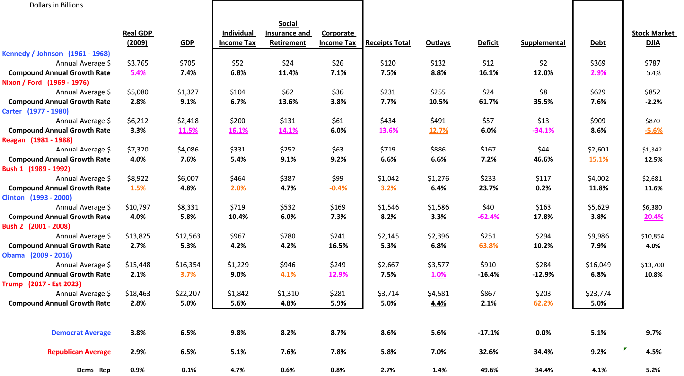
Trump has announced and obtained DOD approval to put 4,000 National Guard Troops at the Mexican Border to reduce the number of illegal immigrants entering the US.  Not that he has ever used data or logic to make such decisions, so I thought I would try to put his decision up against some actual data!

First, I downloaded aprehensions for the Southwest Region from 2000 to 2018 FY to date ,by month,  from US Customs and Border Protection as well as annual data from 1960 to 2017.

For context, take a look at the annual data in simple graph form below:


The first thing to notice is that aprehensions had been steadily increasing from 1960 - 2000 after which a rapid decline began.  For context, in 1979, Reagan campaigned on creating a North American Trade Agreement and through the 1980's negotiations began.  Clinton finally signed the agreement in 1993 and it was put into action in 1994.  The Agreement stated most tariffs were to be eliminated within 10 years. The NAFTA implementation might have been a contributor to the decline beginning 2001, which, by the way, was the first year of the Bush Presidency.

To get a better handle on the compound annual growth rate of apprehensions and the stability, the graphs below analyze the periods prior and post 2000:


From 1974 to 2000, the growth was quite steady at 3.7%, compounded annually, with 1986 showing up as a uniquely different year being above the Upper Control Limit (middle of negotiations?).  From 2001 to 2017 the decline was -8.8% at an undisturbed rate.  It was during these years that both Bush and Obama, sent troops to the border to help with apprehensions, which were already in steady decline.

Using monthly apprehension data beginning in 2000, lets now look at previous troop deployments to assess their impact, remembering the decline of -8.8% indicated a steady, stable decline.

Bush sent 6,000 troops to the border in 2006, which lasted two years, at a cost of $1,200 Mil.  Apprehensions connected with this deployment were only 176,000 of the 2,030,000  two year total or 9%. Clearly there were no INCREASES in monthly apprehensions during this deployment as seen in the graph above.  (The annual seasonal pattern spikes in March and bottoms in December)


The first graph above compares the two years prior to Bush's deployment to the two years of the deployment.  The conclusion would be that apprehensions dropped by 38% due to the deployment.  In the second graph, in the two years after the deployment, apprehensions dropped another 21.5%.  These last 3 graphs would cause me conclude that there was no impact in apprehensions from Bush's deployment. The $1,200Mil spent did NOT produce any "net extra apprehensions"

Below, you will see a similar analysis of the troop deployment done by Obama in 2010 which lasted only one year at a cost of $110 Mil for 1,200 troops.


Again, Obama claimed 18,000 troop based apprehensions during 2010 of the total 447,731 or 4%.  During 2010, average apprehensions dropped by 22.5% as compared to the 2009 and in 2011 apprehensions remained the same as 2010.  So again, troops at the border did not create any additional apprehensions.

So now Trump is sending 4,000 troops to the border as a "hair on fire" reaction to a lack of his wall being funded, but does the data support his reaction?


 Average apprehensions during Trump's administration are 34.7% lower than the average of the Obama years.  You can see that March 2018 is a large rise, but not outside the the Upper Control Limit.

So, troops at the border probably will not make any difference in apprehensions at the border.  Maybe we should just treat this deployment as Trump's Military Parade!  One final thought: Could the rise in apprehensions during Trump's administration be caused by Trump declaring the end of NAFTA, mirroring the rise prior to the implementation of NAFTA we see in the annual data??